Wednesday, November 14, 2012

Artist Post: Fabio Sasso


   Fabio Sasso is a graphic and web designer from Brazil. He has a degree in graphic design, but he quickly began working in web design as web was becoming accessible in Brazil. He has a blog, Abduzeedo, which has become very popular for its tutorials and inspirations. He also has a company with Fabiano Meneghetti in which they design websites for companies. He is currently working as a designer for Google.

    blog, Abduzeedo, has brought Sasso a lot of recognition. It was created originally following Sasso’s experiments with design and has grown from there. It offers tutorials in programs like Photoshop and Illustrator, offers inspiration in areas like architecture, illustration, typography and more. It also features interviews with various artists. It is a great place to find inspiration. In the design of the site itself, you scroll down the page to view different recent posts and they are arranged in rows of two, with fairly large thumbnails and small previews of the text.  Also, at the top of the index page is the featured daily inspiration, which is chosen by the writers and users of the site. It is a very colorful and playful site that is really easy to navigate, which is what Sasso is about. He is about the usability of a site, but still with a creative flare and design.


   On his persona website, on the index page, he has an image of himself at the top, with his name in big, bold letters next to it. He has a brief biography and some thumbnails of his graphic design work, which you can click on. Also, on the left side of the page is his most recent Tweet, which I imagine changes every time he tweets. It is very simple but it offers many links to other sites and social networks so that you can learn more about him and see his work.


Citations:

Tuesday, November 13, 2012

Getting Lost


I went home this weekend, so for this assignment, I went to a weird area of my county that I was unfamiliar with and drove around. The area is just this jumble of small little towns, so you never know where you are, and no one really goes there unless they live there. I thought it would be easy to get lost back there because a lot of the roads aren't marked and there are so many small roads that look exactly the same. 


This was on my way to the area, so it was still a good-sized, lined road.

An overgrown fence in front of an overgrown lane to an old house.

A really old bridge made of wood, which makes the worst sound when you drive over it.

This is what the roads look like. There isn't enough room for two vehicles, so someone has to pull over, but I hardly saw any other vehicles.

What many of the houses looked like along the roads.

Once I got further down the roads, there were many private drives, like this one, that lead to an incredibly expensive waterfront house.

What I saw when I looked out the side windows, fields and farms. 


Thursday, November 8, 2012

Vito Acconci Response


     In chapter nine, Vito Acconci talks about spaces where people go. People go to indoor spaces to stay in groups of people. They are brought to these spaces for similar reasons and there are two reasons why a person would be going there: for the service of the place, or to be a part of that group in the space. There are two types of these places that are “sensed”: a “historical place,” or a “virtual place.” We remember a historical place and we imagine a virtual place. A historical place is “stopped at a certain point in time.” A virtual place is not affected by time for other elements, so a virtual space is much less limited. 

Monday, October 15, 2012

Artist Post #4: Vuc Cosic


     Vuc Cosic is a new media artist who was part of the movement, net.art in the early 90’s. Net.art is another way of saying internet art, which is made to be viewed online and no other way. It was difficult to find much of his art because some of the links on the website are no longer good. Also, the website for Vuc Cosic focuses on other artists from the net.art movement.

     History of Art for the Airports is a series of images, some of them animated, that are simplified versions of famous artworks. They are simplified to look like the signs in airports. Cosic has an interest in history, having originally been an archaeologist, which explains his choice of showing artworks through history.


     The piece titled Venus is representing the famous statue, Venus de Milo, which is missing both arms. So in Cosic’s piece, he simplified it by making it look like the instantly recognizable symbol for woman, and cut of the arms where they were severed in the statue. 


     He also did several images from films, like King Kong. He placed the woman symbol on top of a hand symbol and animated it so that the hand gets bigger, like it is moving up toward you. This is recognizable as King Kong because the hand is much larger than the woman, showing the scale, and this actually occurs in the movie.  

     Most of these images are recognizable to most people and the simplified versions become humorous because we are familiar with the originals and with the style of airport signs and the combination of the two creates a new meaning. The airport symbols, like bathroom signs, are designed to be universally recognizable; they are incredibly simplified so that everyone will understand what they mean. For example, bathroom signs are separated into men’s and women’s by one simple thing: the woman is wearing a dress. Other than that, they are exactly the same. So by simplifying these artworks, he is making them more iconic and more recognizable to everyone. He is breaking them down into the most prominent features, the features that we would remember about that piece. So when we see the sign, we can recognize that one element and be able to identify the piece or the artist.

Warhol, Cambell's Soup Can


Duchamp, Nude Descending Staircase


Lumiere Brothers, Arrival of a Train at La Ciotat

Citations:
http://www.ljudmila.org/~vuk/history/
http://rhizome.org/artbase/artwork/1725/

Wednesday, October 10, 2012

My Progress

   
      Here is my portrait so far. There have definitely been some challenges to this. I'm still trying to get used to the pen tool. I have difficulty with it because it will fill a much larger area than I want it to and then I can't seen the line of whatever I'm trying to go over. Another problem I've had is keeping my layers straight. I don't pay much attention to what layer I'm in when I start drawing and then I end up having to move whatever I just drew to a different layer. I also have a hard time choosing the right color for different shadows and skin tones. I am most likely going to be altering all of the skin tones that I have so far to make them all seem more cohesive and more similar. Also, I haven't yet decided what to do with my background, but I haven't really been thinking about that yet. Right now, I think the biggest issues I've had are choosing the right skin tone and getting the lines/ shapes right using the pen tool.

Monday, October 1, 2012

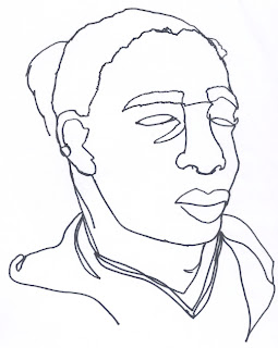
5 Portraits:


 Chuck Close, Big Self-Portrait
 Steve McCurry, Afghan Girl


Vincent Van Gogh, Self-Portrait

Wednesday, September 26, 2012

Artist Post #3: Charles A Csuri


            Charles A. Csuri, an American artist born in 1922, is considered one of the pioneers of digital art. He began experimenting with digital art in 1964, making computer animated films and digital 2D artwork. Many of his pieces used algorithms and different softwares that he created. He has been creating digital art for more than 40 years, since the beginning, when they were designing the software needed to create different affects and he is still alive and creating digital art.
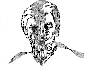
            His piece from the reading, Sine Curve Man, made with James Schaffer, is a portrait of a man who is distorted or seems to be melting. They created the effect by laying one image of a man over top of another and displacing them using sine waves. You can see the separate lines of each image, creating a sort of echoing effect, sort of like when an image on film is distorted when a signal or connection is being lost. It seems like there is a glitch and the image keeps repeating when it shouldn’t be, and the result somewhat disturbing and gruesome. The face looks like it has been mutilated or distorted in some way. Unlike many people working in computer art, Csuri actually had a background in art. He was a painter, which can be seen in a lot of his work. Many of his pieces, like combinePICS_1974, have a more classical look to them. This image in particular looks like a virtual 3D still life. The background looks like paint, but is clearly pixelated at the same time. Also, there is a strong light source one what appears to be oranges, again characteristic of a still life. There are many images similar to this one, images containing spherical 3D shapes that are only partially there, with a sense of fantasy to them. And again, most of his work is using specific algorithms to create the art.
 Sine Curve Man
 combinePICS_1974
 Infinite Universe
 Frozen Moment
astroTEX

            What I’ve noticed about a lot of his work, or the pieces that I took a closer look at, even though they aren’t necessarily representational, is that they have a really strong sense of space and texture, which I appreciate because many of the other artworks from the reading don’t have that same sense; they feel more flat and just seem like patterns. Also, his painting background really comes through in his work. I also appreciate that you can see some of the more classical elements of art in his work because it makes it easier for me to understand and relate to, rather than just an algorithm creating some pattern. With Sine Curve Man, a mathematical system was being used, however there is still the recognizable image of the portrait of a man.

Citations:
http://www.csurivision.com/
http://www.siggraph.org/artdesign/profile/csuri/